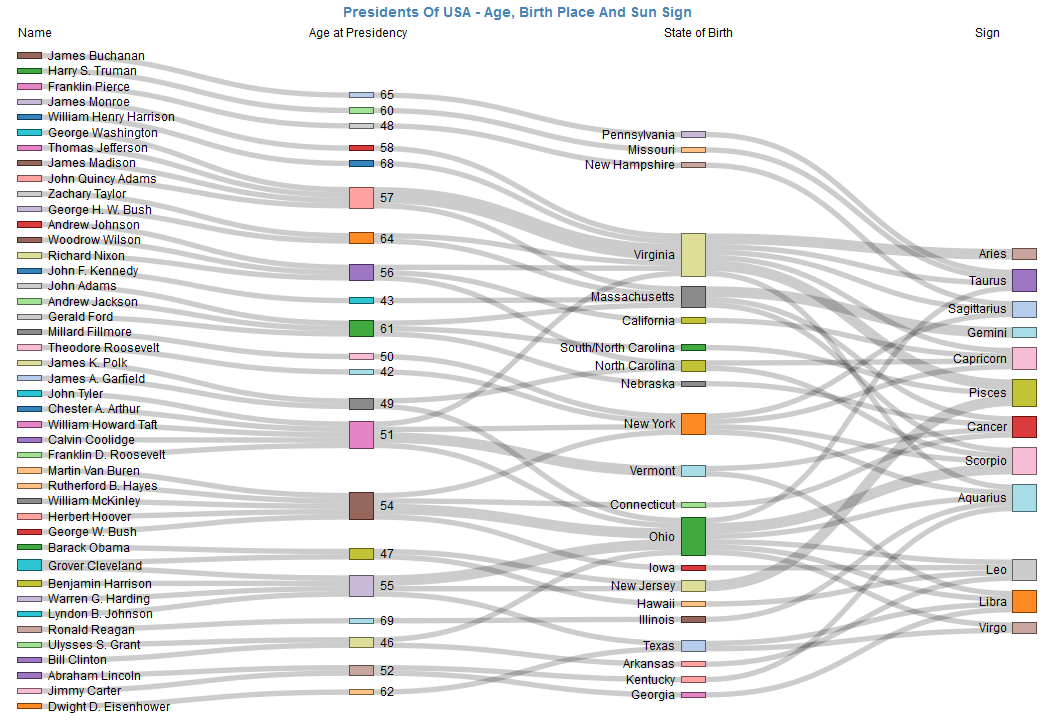
The above sankey now forces you to view the left hand side as the Source and the right hand side as the destination.
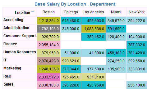
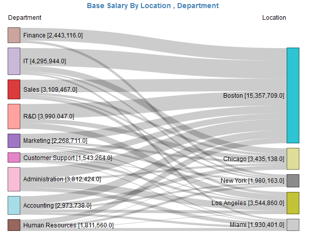
We will see that Sankey Diagrams add tremendous “Expressive Power” and your normal “boring” pivot tables become quite interesting.
Problems with Sankey
Sankey diagrams can be difficult, frustrating and time-consuming produce by hand. Until now, it was super frustrating to build sankey diagrams and various flows using flow charting or other specialized software. Just like other complicated hierarchical charts like Circle Pack, Sunburst, Tree Cluster/Dendograms, InfoCaptor has incorporated Sankey as part of the visualization library. What this means is, any user can produce Sankey diagrams by simple drag and drop operations.
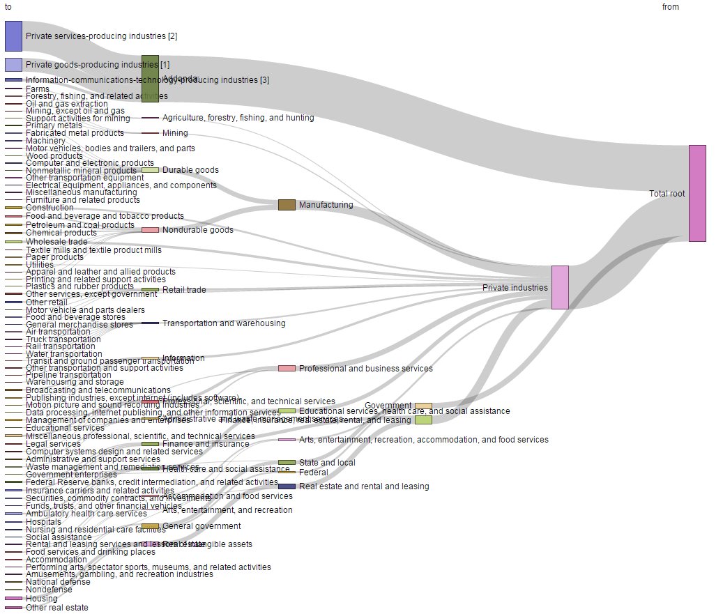
The other problem with automated Sankey diagram software, you need to provide data in a special format, you need to clearly mark your from and to nodes. This is greatly simplified within InfoCaptor, all you need to do is provide atleast one dimension and you can generate a Sankey diagram. InfoCaptor will automatically detect any parent child relationship and incorporate them into the visualization. Not only that, if there was some problem with data, like Circular loops or Circular references where one child node points back to the parent, InfoCaptor will automatically detect those loops and mark them appropriately in the visualizations.
When to use Sankey
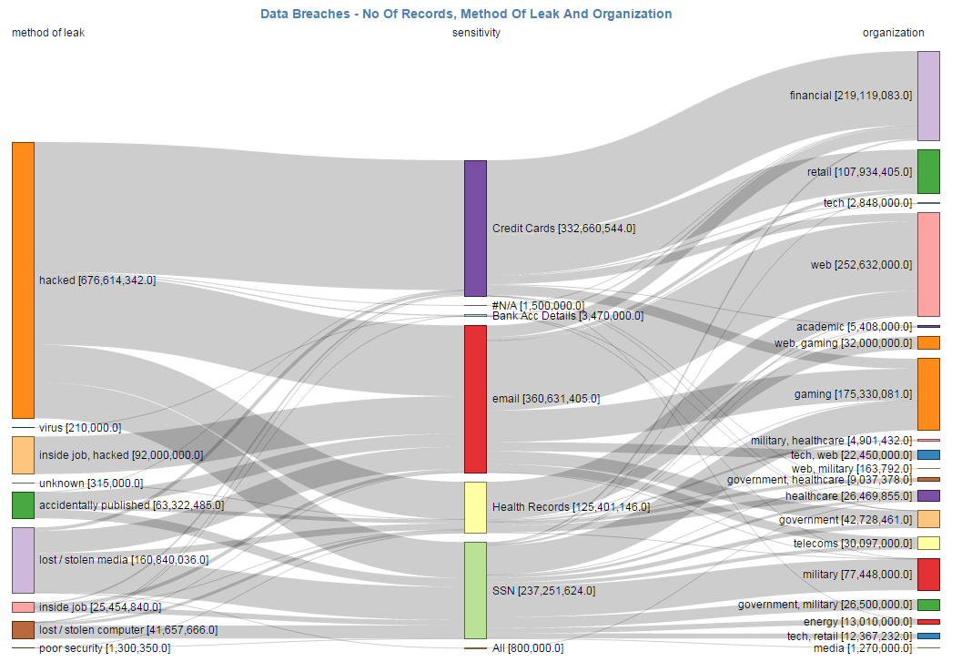
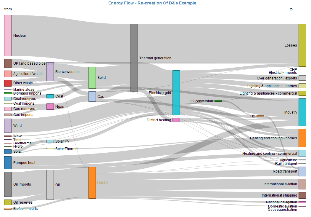
It is pre-dominantly used in visualizing Energy flow systems but you can use it to show budget data, Balance sheet visualization, Profit and Loss and most importantly within InfoCaptor you can add multiple dimensions to build a Sankey that resembles the Parallel coordinates diagram. With this much visualization power, there is no reason for Sankeys to be limitted just few niches like Energy and budget flow visuals.
- Energy input/output/losses Visualization
- Budget flow, how money flows from one department, through various fund categories, programs etc
- Visualize the boring Balance sheet/Profit loss statements
- Visualize GDP of a country
- Thermodynamics [Exergy]